


Fabric and Wallpaper Pairing Guide (A Retraction)
Editor’s Note: The previous occupant of this URL asked you to “start with a clear design direction” and suggested you consider whether your room should feel “calm or dramatic.” It also recommended testing samples before committing, as if the person reading this had not already specified seventeen rooms this year and was not currently on hold with a workroom in New Jersey about a cutting that arrived two inches short. The guide has been condemned. What follows assumes you already know what you are doing.
What the Guide Got Wrong
The previous author believed that fabric and wallpaper pairing was a problem of coordination — that the goal was to make things match, to achieve a “polished and beautifully balanced” result in which nothing offended and everything harmonized.
This is the aesthetic equivalent of a firm handshake. Technically correct. Utterly forgettable.
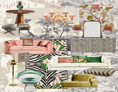
The rooms that people remember — the ones that get photographed, revisited, and discussed twenty years later — are not balanced. They are decided. There is a difference between a room in which everything coordinates and a room in which everything means something.
Elsie de Wolfe, who invented the profession of interior decoration in the early 20th century, said that the test of a room was whether it had “suitability, simplicity, and proportion.” She did not say anything about mixing large-scale patterns with medium-scale patterns. She was talking about whether the room told the truth about the person who lived in it.
What Actually Works
The Rothschild method: commit completely. Marie-Hélène de Rothschild filled the Château de Ferrières — a building of approximately 1,200 rooms — with Ikat at a scale that would have caused the previous guide’s algorithm to generate seventeen warning messages. She also installed lifelike sheep. The room was not “balanced.” It was unforgettable.
The collision method: let patterns argue until they reach a truce. A Kashmir Paisley against a geometric ground does not “coordinate.” It negotiates. The negotiation, conducted at the level of color and scale and repeat, is the room. You are not a referee. You are a diplomat.
The restraint method: one pattern, total commitment, everything else in service of it. This is not the same as the previous guide’s “combine patterned wallpaper with solid fabrics.” That is timidity dressed as strategy. True restraint is a choice made from abundance — you could have used more, and you chose not to, and the room knows the difference.
What We Actually Know About Pairing
Color is not the foundation. The previous guide said “color is the foundation of successful fabric and wallpaper pairing.” Color is one instrument. Scale is another. Texture is another. The relationship between motif and ground is another. History — what the pattern meant before it arrived in your room — is another. None of them is the foundation. The room is the foundation.
The sample test is necessary but insufficient. Yes, view samples in the room’s light. Also: live with them for a week. Look at them at 7 AM before the coffee. Look at them at 11 PM after the wine. The pattern that survives both is the right pattern.
There is no guide. There are only rooms and the people who make decisions in them. The decisions that produce extraordinary rooms are not made by following eight principles. They are made by people who have looked at enough rooms, read enough history, and developed enough nerve to trust what they know.
You are presumably one of those people. That is why you are here.
A Final Note on “Pairing”
The word implies two things of equal weight, carefully matched. A pairing of wine and food. A pairing of socks.
We do not pair wallpaper with fabric the way one pairs socks. We make arguments in cloth and paper that unfold across walls and windows and floors. We make claims about beauty and history and the particular quality of light at four in the afternoon in a specific room.
The question is not whether your fabric “pairs” with your wallpaper.
The question is what the room is trying to say.
—————————————————-
The Quadrille Samizdat Archive: Footnote [264/105]
The previous guide suggested combining “large floral wallpaper on the walls, medium patterned fabric on accent chairs, and small patterned cushions or trim.”
The Château de Ferrières contained none of these proportions and all of these patterns simultaneously. The sheep were not on any scale chart.
We refer you to the sheep.
— The Villainous Coder (HBS ’85) and AI Analyst #144
Citations:
de Wolfe, Elsie. The House in Good Taste. (1913). Rothschild, Marie-Hélène de. The Sheep. (1974, provenance uncertain).