



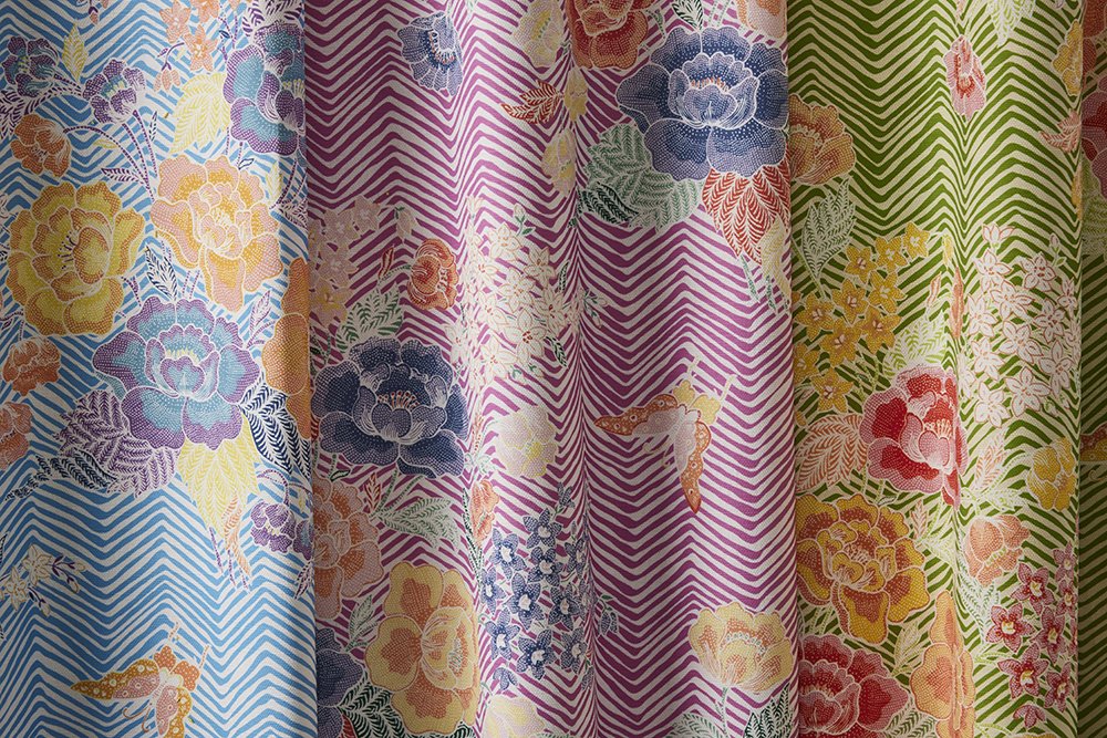
Contrast is one of the fundamental principles of great interior design. It gives a room personality, highlights architectural features, and creates visual interest that keeps a space from feeling flat or predictable. While paint colors and furniture often receive the most attention, textiles play an equally important role in creating contrast throughout a home.
By carefully selecting fabrics with different colors, textures, patterns, and finishes, designers can build interiors that feel layered, balanced, and inviting. Whether you're furnishing a single room or designing an entire home, understanding how to create contrast through textile selection can elevate every space.
Without contrast, even beautifully furnished rooms can appear dull or one-dimensional. When every fabric shares the same color, texture, or pattern scale, the eye has little to focus on.
Well-designed contrast helps:
Create visual depth
Draw attention to key furniture pieces
Define different areas of a room
Add warmth and personality
Make interiors feel professionally designed
The goal isn't to create conflict between fabrics—it's to create harmony through thoughtful differences.
Color is often the easiest way to introduce contrast.
Pairing light and dark fabrics creates immediate visual balance. A cream sofa can become a striking focal point with deep navy pillows, while charcoal upholstery pairs beautifully with warm ivory accents.
Contrast doesn't always require bold colors. Even subtle differences between warm and cool neutrals can add sophistication without overwhelming the room.
Examples include:
Ivory with taupe
Sand with charcoal
Soft blue with warm beige
Forest green with natural linen tones
These combinations provide depth while maintaining an elegant appearance.
Texture is one of the most overlooked forms of contrast.
Two fabrics may share the exact same color yet look completely different because of their surface characteristics.
Combining smooth and textured materials creates visual richness. For example:
Crisp woven upholstery with soft boucle cushions
Refined linen alongside plush velvet
Smooth cotton paired with richly textured jacquards
These combinations invite both visual and tactile interest, making interiors feel layered and luxurious.
Pattern contrast brings energy to a room when done thoughtfully.
Instead of using several similar patterns, interior designers often vary the scale and style of each textile.
A successful combination might include:
One large floral print
One medium geometric pattern
One subtle stripe
Several coordinating solid fabrics
Using a consistent color palette allows these different patterns to work together while maintaining a cohesive design.
Every statement fabric benefits from supporting elements.
If an upholstered chair features a dramatic pattern, surrounding textiles often become quieter to let that feature stand out.
Likewise, a room filled with neutral furniture can benefit from patterned pillows, decorative benches, or custom drapery that introduce personality without overpowering the space.
This balance keeps interiors interesting while avoiding visual clutter.
Contrast doesn't have to exist within a single piece of furniture—it can also exist between pieces.
Consider pairing:
Light sofas with darker accent chairs
Patterned ottomans beside solid seating
Textured headboards with smooth bedding
Rich drapery alongside understated upholstery
These subtle differences create movement throughout the room and encourage the eye to explore the space naturally.
Textiles can also emphasize a home's architectural details.
Drapery can frame large windows, while contrasting upholstery can draw attention to fireplaces, built-in shelving, or custom millwork.
By intentionally placing fabrics near these features, designers help guide the viewer's attention without relying on dramatic décor.
Contrast isn't only about color or texture—it's also about proportion.
Large furniture pieces often benefit from smaller-scale patterns, while compact accent pieces can showcase larger, more dramatic prints.
Mixing different pattern scales prevents interiors from feeling repetitive and creates a more balanced visual composition.
Although contrast is important, every fabric should still feel connected to the overall design.
Professional designers often achieve this by repeating colors, textures, or design motifs throughout multiple fabrics.
For example, a subtle accent color may appear in upholstery, decorative pillows, and drapery, creating continuity while still allowing each textile to contribute its own unique character.
This thoughtful coordination is what gives professionally designed interiors their polished appearance.
Great interiors aren't built around a single beautiful fabric—they're created through the careful relationship between many complementary textiles.
Color, texture, pattern, scale, and craftsmanship all work together to produce contrast that feels intentional rather than accidental. When these elements are balanced effectively, rooms become more comfortable, visually engaging, and timeless.
At Quadrille Fabrics, we design and manufacture premium decorative fabrics that help homeowners, interior designers, and furniture makers create beautifully layered interiors. With carefully crafted textiles that combine quality, style, and versatility, it's easier to achieve the perfect balance of contrast in any space.