



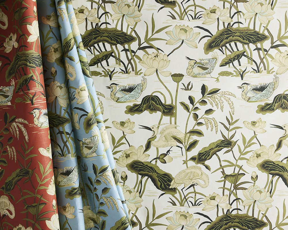
When choosing fabric for an interior design project, the pattern itself is only part of the decision. The colors used within that pattern can completely change its appearance, mood, and relationship with the surrounding space.
This is where fabric colorways come in.
A single fabric design may be available in several different color combinations, allowing designers and homeowners to select the version that works best with their interior. Understanding what a fabric colorway is—and how to choose one—can make selecting textiles for upholstery, curtains, pillows, and other applications considerably easier.
A fabric colorway is a specific combination of colors used in a fabric design or pattern.
The underlying design generally remains the same from one colorway to another, while the colors used within that design change.
For example, imagine a botanical fabric featuring large leaves and flowers. One colorway might combine blue, green, and ivory, while another version of the exact same pattern could feature coral, pink, and cream.
The pattern has not changed. Its colorway has.
Colorways allow textile designers to reinterpret a single pattern for different color palettes, decorating styles, rooms, and moods.
Interior spaces vary enormously in their color palettes. A pattern that looks beautiful in a coastal-inspired blue and white room may need an entirely different palette to work in a warm, traditional living room.
Offering a fabric pattern in multiple colorways gives designers greater flexibility.
The same design can feel surprisingly different depending on its colors. A botanical print rendered in pale blue and green may feel light and relaxed, while the same print in deep red, brown, and gold can appear richer and more dramatic.
Multiple colorways also make it possible to use a beloved pattern without redesigning an entire room around it.
Instead, designers can find the version of the pattern that complements the existing palette.
Color is one of the most powerful elements of textile design.
Changing a fabric's colorway can alter the visual impact of a pattern even when every line and shape remains identical.
Patterns featuring white, cream, beige, pale gray, or other subtle colors often create a softer appearance.
These colorways can work beautifully in relaxed bedrooms, airy living spaces, coastal interiors, and rooms where the fabric is intended to complement rather than dominate the design.
Vibrant blues, greens, yellows, oranges, pinks, and other saturated colors can make the same pattern considerably more energetic.
Colorful fabrics are particularly effective for accent chairs, curtains, cushions, upholstered headboards, and other applications where the textile is intended to become a focal point.
Navy, charcoal, burgundy, chocolate, forest green, and other deep colors can add richness and visual weight.
A pattern that feels playful in a pastel colorway may become sophisticated and dramatic when produced in darker shades.
This versatility is one reason textile designers often develop several colorways for a successful pattern.
Although the terms are related, pattern and colorway do not mean the same thing.
The pattern refers to the actual design printed, woven, or otherwise created on the textile. It includes elements such as flowers, stripes, geometric shapes, abstract forms, or other motifs.
The colorway describes the particular colors used to produce that design.
Think of the pattern as the drawing and the colorway as its palette.
A manufacturer might therefore offer one pattern in five, ten, or even more colorways.
Developing colorways is an important part of the textile design process.
Designers consider how different colors interact with one another, how they affect the visibility of individual elements within the pattern, and how the finished fabric might work in an interior.
This process involves much more than simply swapping one color for another.
Contrast, saturation, balance, background color, and the relationship between individual shades can dramatically affect the finished textile.
For example, increasing the contrast between a pattern and its background can make the design appear stronger and more graphic. Using closely related colors may produce a quieter and more subtle result.
A thoughtfully developed colorway preserves the character of the original design while giving it a distinct personality.
When several versions of a pattern are available, choosing between them can sometimes be surprisingly difficult.
A few considerations can help narrow down the options.
Start with colors that are already present in the room.
Look at walls, flooring, rugs, furniture, artwork, and other textiles. A fabric does not need to perfectly match these elements, but its colorway should have a deliberate relationship with them.
Sometimes one shared color is enough to connect a patterned fabric to the rest of the room.
Ask whether the fabric should be a focal point or a supporting element.
If an upholstered chair or pair of curtains is intended to make a statement, a bold or high-contrast colorway may be appropriate.
If the room already contains several visually dominant elements, a quieter colorway may create better balance.
Color and pattern scale work together.
Large-scale patterns in strong, contrasting colors tend to attract considerable attention. The same pattern rendered in similar or muted shades may feel much more restrained.
Small-scale patterns can also become visually stronger when highly contrasting colors are used.
The right choice depends on how prominent you want the fabric to appear.
The background—or ground—of a patterned fabric can have an enormous influence on its overall appearance.
A floral pattern printed on white may feel fresh and crisp. The same motif on a dark blue background could feel much richer and more dramatic.
When comparing colorways, don't focus exclusively on the colors within the motif. Consider the ground color as part of the overall palette.
Colors displayed on a computer or phone screen may not perfectly represent a physical textile.
Screen brightness, photography, display settings, and surrounding light can all influence how colors appear digitally.
For an important interior project, viewing a physical fabric sample can therefore be extremely helpful.
A sample also allows you to see how the textile responds to the actual lighting in the room.
Natural daylight, warm artificial lighting, cool LEDs, and evening light can each affect how a color appears.
Place the sample near the furniture, walls, flooring, and other materials it will ultimately accompany and observe it at different times of day.
When selecting an upholstery fabric colorway, consider the size and visual importance of the piece being upholstered.
A small accent chair can be an excellent place to experiment with a particularly colorful or dramatic pattern.
A large sofa occupies significantly more visual space. A strong pattern or high-contrast colorway will therefore have a much greater influence on the room.
There is no rule that large pieces must use neutral colors. Bold upholstery can be spectacular when incorporated intentionally.
The important consideration is proportion.
A fabric sample may look relatively subtle in your hand but become dramatically more prominent when covering several yards of furniture.
Patterned curtains provide an opportunity to display a fabric across a large, relatively uninterrupted surface.
This can make the pattern—and its colorway—a significant part of the room's design.
Consider how the fabric relates to both the wall color and the natural light entering the room.
A colorful pattern can transform simple window treatments into an important decorative feature, while a softer colorway can introduce pattern without overwhelming the space.
Roman shades, café curtains, valances, and other window treatments can similarly provide opportunities to introduce distinctive fabric colorways.
Different patterns do not necessarily need to contain exactly the same colors to work together.
In fact, rooms can often feel more interesting when their textiles are coordinated rather than perfectly matched.
One fabric might contain blue, green, and ivory, while another incorporates blue, rust, and cream. The shared blue can provide enough visual continuity to connect the two.
Designers can also combine variations in scale, pattern type, and color intensity.
For example, a large botanical print might be paired with a smaller geometric design and a simple stripe. Carefully chosen colors help these different patterns feel intentional when used together.
Yes, although it requires some consideration.
Using multiple colorways of the same fabric pattern can create an interesting sense of repetition while introducing additional color.
It works particularly well when the selected colorways share one or more shades.
However, repeating the exact same pattern extensively can become visually overwhelming. Combining it with solid fabrics, stripes, textures, or complementary patterns can provide balance.
Certain color combinations naturally complement particular design aesthetics, although these should be treated as inspiration rather than strict rules.
Blue and white colorways can feel fresh and timeless and are particularly popular in coastal and traditional interiors. Earthy greens, browns, ochres, and rust tones can create warmth and an organic quality. Bright, contrasting colors can suit eclectic and maximalist spaces, while understated neutral palettes can complement contemporary interiors.
The beauty of a well-designed textile is that the same pattern can cross stylistic boundaries simply through a change in colorway.
Colorways give designers freedom.
Rather than treating a textile pattern as a single fixed design, multiple colorways allow that pattern to take on different personalities.
One version might be bold and energetic. Another could be elegant and understated. A third might feel playful, coastal, traditional, contemporary, or dramatic.
Understanding fabric colorways therefore makes it easier to look beyond the pattern itself and consider how a textile will actually function within an interior.
At Quadrille Fabrics, color and pattern are central to textile design. Exploring different colorways allows designers and homeowners to discover how the same pattern can create entirely different effects depending on the surrounding interior.
Whether selecting fabric for upholstery, curtains, cushions, window treatments, or another interior design project, consider both the pattern and its colorway before making your final choice.
The right combination can transform a beautiful textile into one that feels as though it was made for the room.